Kate Katruk WorkAbout Connect
← Works

January 2026

Holodomor

Dataviz installation

About

The Holodomor data visualization poster extends Issue 1 of Relay, an independent magazine exploring cultural trauma.

Through infographic design, the poster turns historical material into a clear visual system, highlighting the scale, mechanisms, and consequences of the famine.

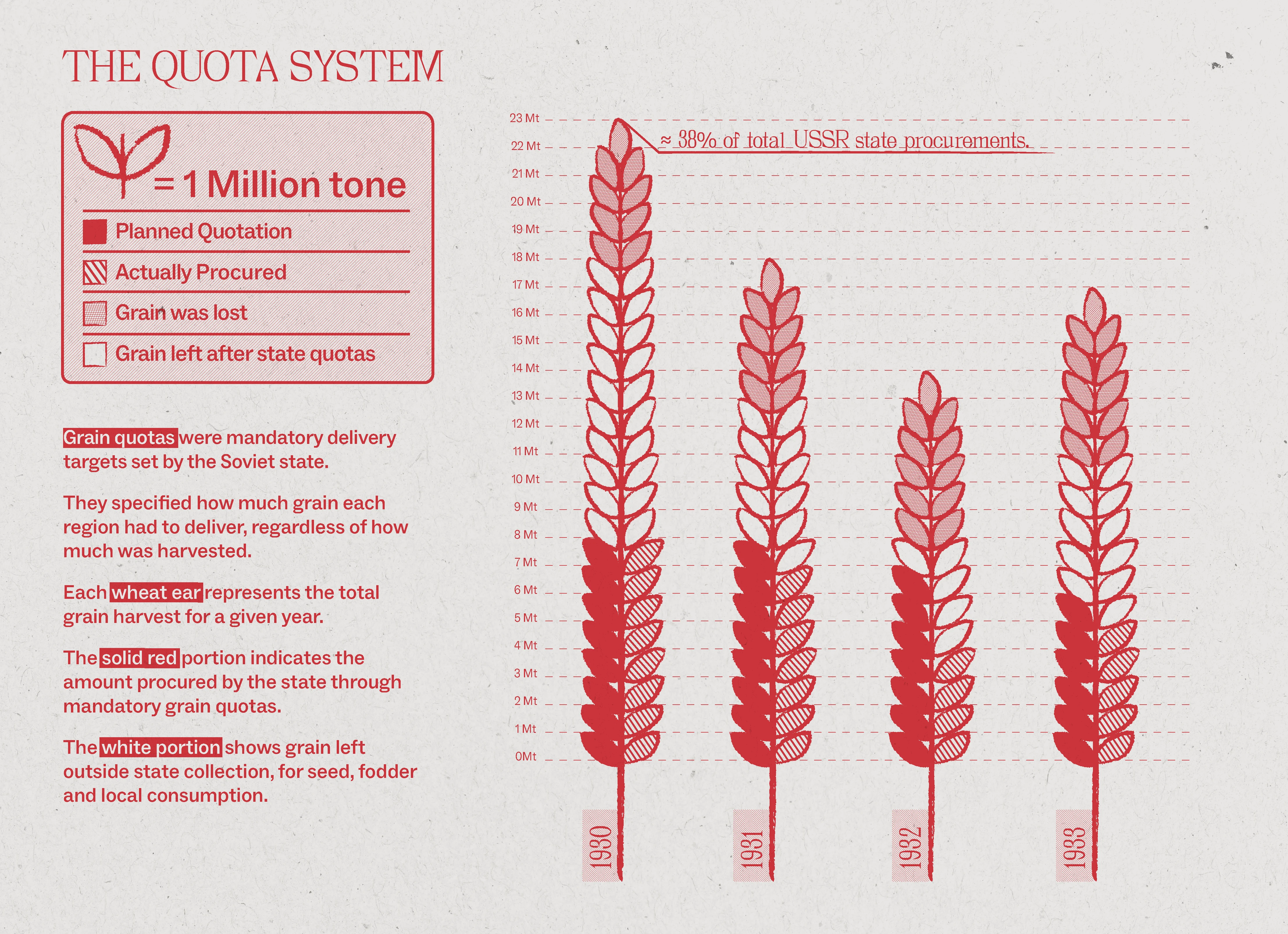
The quota system

Grain quotas were mandatory delivery targets set by the Soviet state. They defined how much grain each region had to provide, regardless of the actual harvest or local food needs.

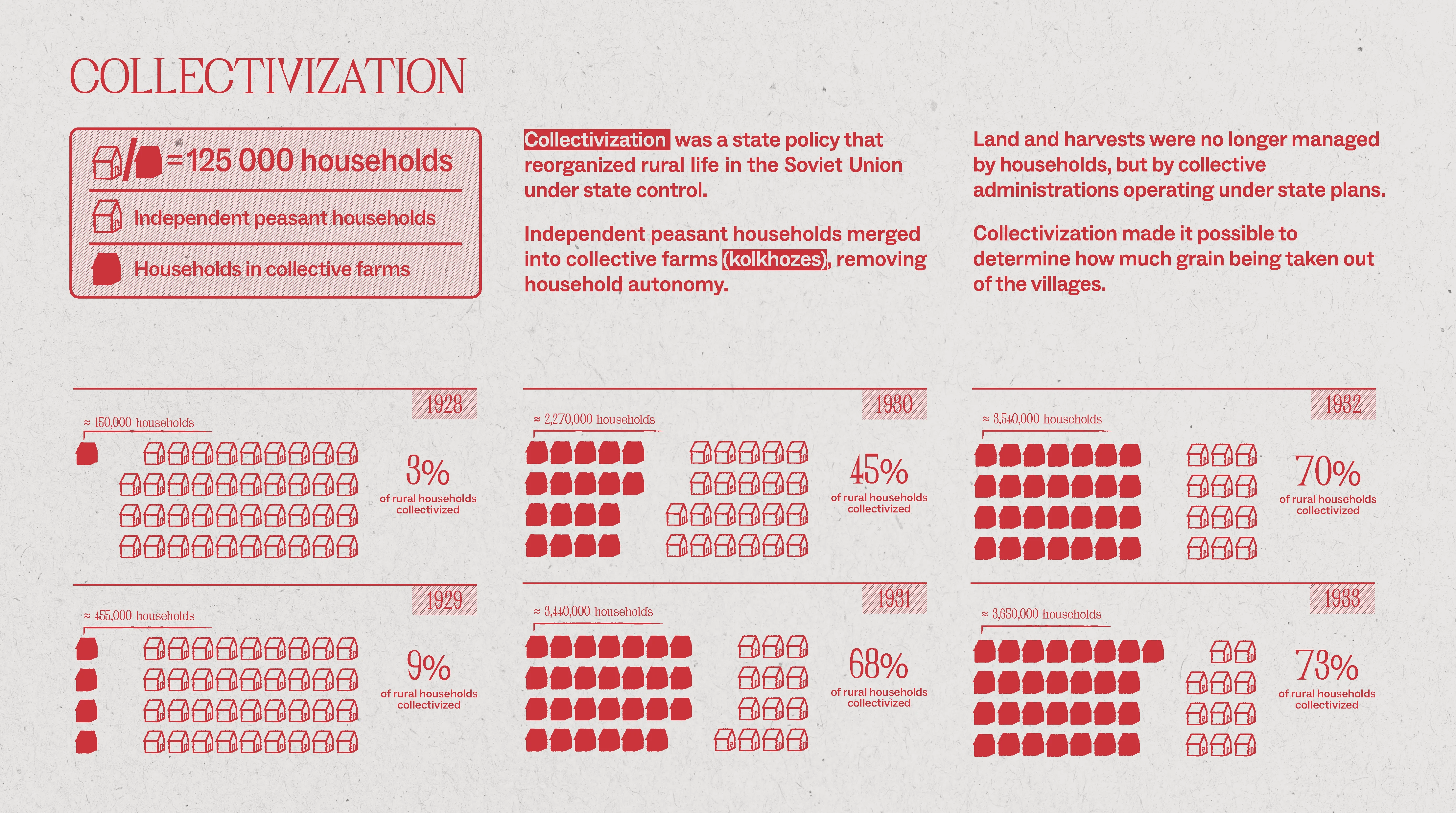
Collectivisation

Collectivisation reorganised rural life under Soviet state control. Independent peasant households were merged into collective farms, removing control over land, harvests, and resources. This made it easier for the state to control production and extract grain from villages.

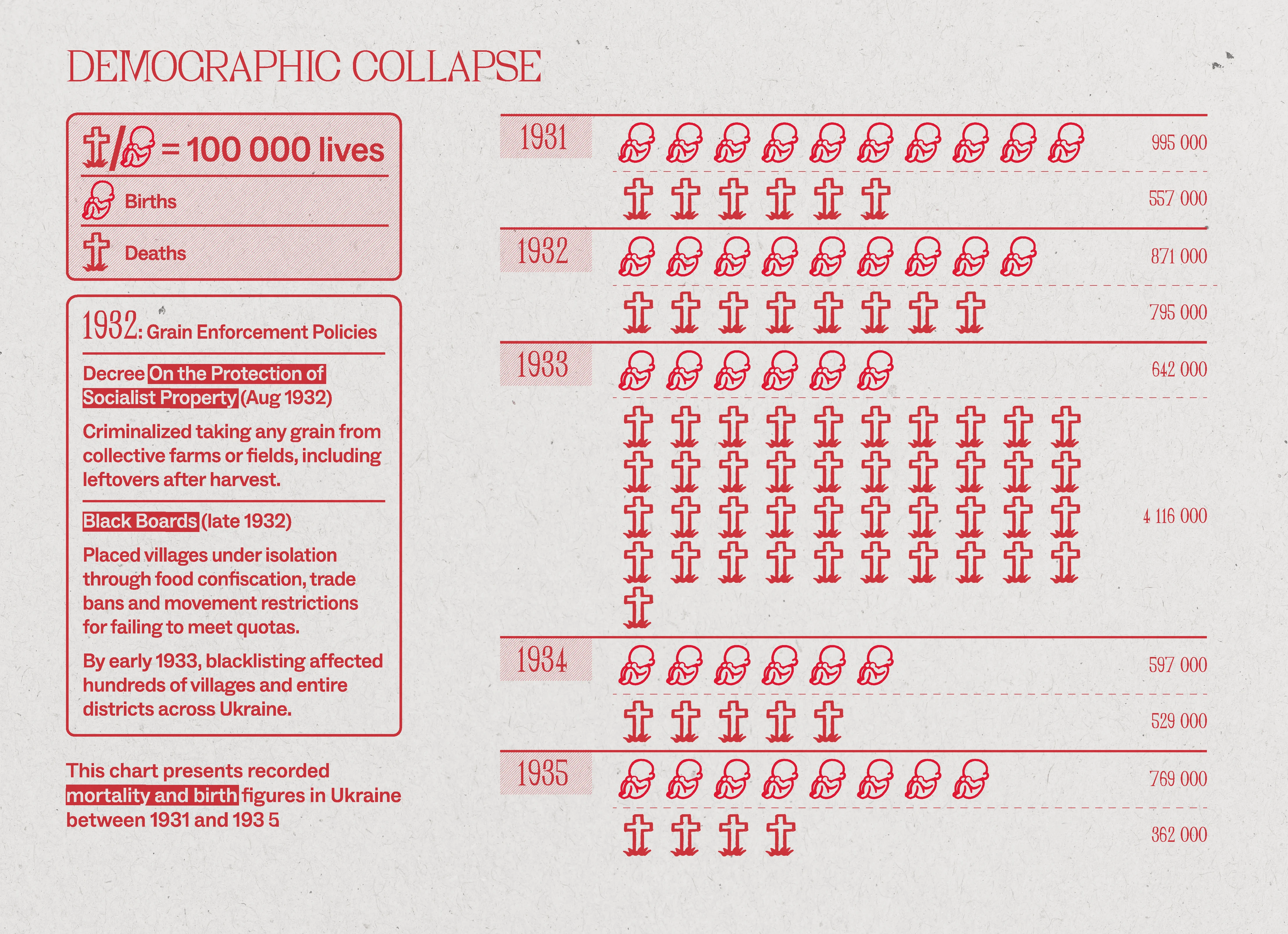
Demographic collapse

The famine caused a sharp demographic collapse, visible through rising death rates, falling birth rates, and long-term population loss. The chart compares recorded births and deaths in Ukraine between 1931 and 1935, showing how the famine disrupted the natural structure of population growth..

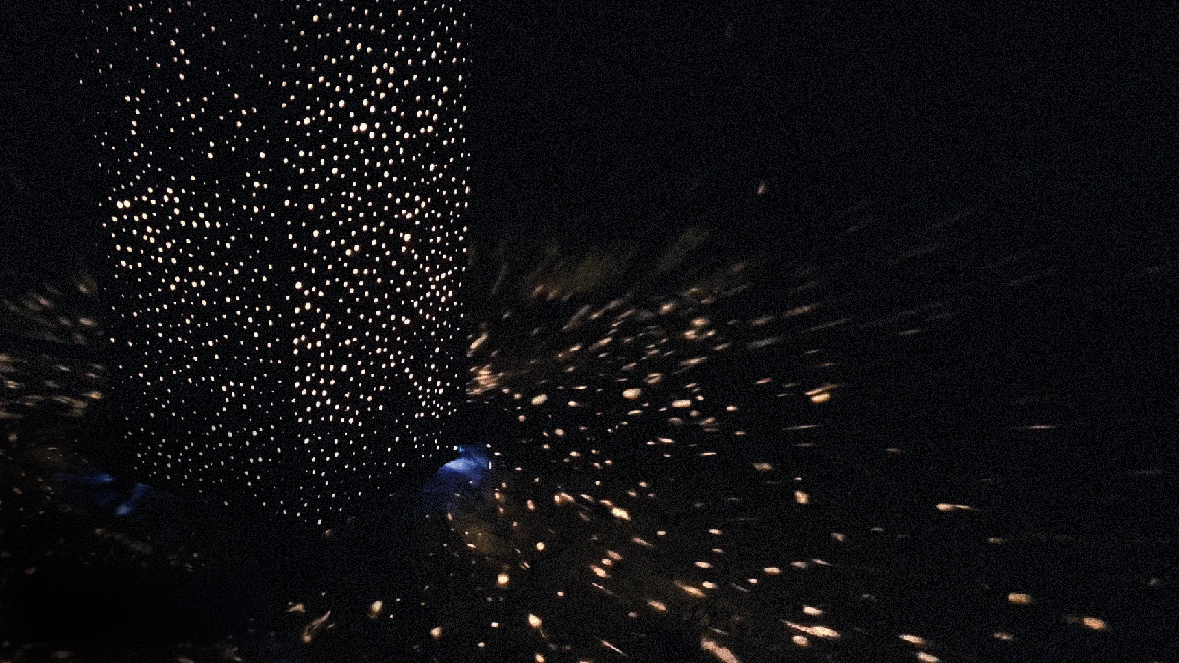
Physicalisation

This installation was developed to move beyond historical data and create a more immediate encounter with the scale of loss. Drawing on the Ukrainian practice of lighting candles in memory of Holodomor victims, it uses illuminated dots to form a collective lost.

Each dot represents 1,500 lives, turning numerical data into a spatial and immersive visual experience.

Holodomor poster Holodomor infographic panel Holodomor infographic panel Holodomor infographic panel
Holodomor physicalization